Make sure your colleagues get the picture with image comments
When we speak to our customers, we tend to take notes.
We’re a tech company, so those notes tend to be digital, but if they were on paper they’d have “teamwork is key” underlined ten times and circled in red. Because every conversation we have, this is a key takeaway.
There are so many combined years of experience, so many interdisciplinary perspectives, and so many new ideas for new methods within our customers’ teams. These teams, depending on how you define them, include growers, R&D, IPM specialists, irrigation specialists, third party consultants and advisors, as well as other organisations across the chain. They all benefit from a greater understanding of crop conditions, from seed to finished product.
Agri has 24/7 needs. The discussion shouldn’t be 9 to 5.
If you’re in the horti- or agri- industry, whether you’re pooling knowledge and exchanging insights with colleagues a continent away or a greenhouse away, the conversation shouldn’t stop (or be any less informative) just because you aren’t face to face.
A good, comprehensive (and interactive) record of this shared knowledge is also highly valuable— it ensures all teams are on the same page, provides great documentation for new employees, and can serve as a blueprint for future problem solving. Besides internal knowledge exchange, this kind of documentation can be used to demonstrate compliance, or to minimise liability. When it comes to our customers’ needs, we’ve found it’s usually a combination of all three.
Accurate crop data is crucial to a healthy, productive harvest. But so is communication. We know that live sensory data can be a game-changer, but to make the most of it, growers need to be able to discuss that data, and make better decisions as a result.
Keeping the conversation around agri-data going— seamlessly— is our mission.
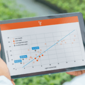
In our last major release, we brought you comments and groups to drive greater collaboration. Comments make it easy to annotate data on any widget type— heatmaps, visualizations, single values or charts.
Our next release, feeds, made it simpler to watch colleagues’ discussions unfold, and jump in when needed.
Now, with image comments, we’re taking collaboration around agri-data to the next level. And we’re still far from finished.
Better decisions with visuals
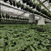
As we’ve seen from our customers, decisionmaking in horti-and agriculture is very visually-driven. Chris Need may have put it best when he said “It’s not about replacing looking at the plant, or going into the greenhouse. It’s about adding a new level of context and insight that we previously didn’t have. The problem with only looking at the plant is that you’re just seeing the snapshot, the plant at a given moment. You don’t see what it has experienced, or what it will experience.”
With comments that enable image attachments, we’re bringing together the power of looking at a plant, and the plant’s historical context with sensory analytics— all while leveraging the wisdom of the group from anywhere in the world.
When adding a comment, ZENSIE users can now attach multiple images in JPG, PNG or GIF.
The data expressed through widgets in ZENSIE is anything but abstract. It’s not just numbers, or a dot on a chart, it corresponds to a real crop, pallet or container. Images add another tangible anchor to the information ZENSIE widgets provide.
We haven’t reinvented the wheel, but we may have streamlined it a little
As with all our hardware and functionality, images in comments came by request, suggested by growers in our community.
Growers have always been innovators, and we know that many of our customers have been sharing knowledge with the use of photographs already. But whether they’ve been doing so with screenshots from ZENSIE and image attachments on email, or group chats on third party messenger apps, these exchanges have happened in a fragmented way, away from the live data they’re based on.
Sensor data, and the discourse surrounding it is valuable intellectual property. This new feature not only ensures that our customers’ charts, heatmaps, visualizations, and the conversation around them are interactive and accessible in a single location on an ongoing basis, it guarantees that this conversation occurs within a platform that’s clear on who that intellectual property belongs to. (Spoiler: it’s the customer).
Adding visual context to live crop data has so many potential applications, and we can’t wait to report back on how our customers (200+ of them) will put this feature to work for them. Here’s some feedback we’ve already gotten from our community, about how they’re excited to use the feature:
Watching crop development as it unfolds
In R&D, real-time monitoring provides the opportunity to manipulate plants and the grow environment, and do research in commercial conditions. With images as part of the discussion, researchers have further context when evaluating and sharing their results.

With visual attachments (photos, diagrams) to comments on dynamic charts, growers can see the exact microclimate and environmental context when a crop changes appearance (indicating, for example, when it is generative or vegetative). Because dashboards are modular and highly customisable, each user can organise data in their own way with widgets and tabs. Growers can track crops across locations or sections of a facility, and anchor their understanding of crop states with images.
Continuous pest management, from anywhere
We hear it all the time: from counting insects to diagnosing leaf maladies, a good IPM strategy relies on visualisation. With image comments, growers and consultants can leverage the visual component of pest and disease management, identify and compare inconsistencies and pathologies across locations, work together to optimise strategies remotely and keep a continuous record of the best conditions for healthy crops.

Traceability and quality control
Granular, sensory data and traceability software are a match made in agri-heaven. Live data helps monitor storage conditions, identify anomalies and prioritise pallets for delivery.With images, data from ZENSIE can now provide a visual record for quality assurance pre-dispatch. (Our customers have mentioned two examples: images of potato cross-sections for quality assurance, and sample images of berries before dispatch.)

From photographs to diagrams, maps to screenshots of documents, image attachments in comments are another step to making working with agri-data more collaborative and dynamic. We can’t wait to share more real-life customer applications of this feature as they emerge.


30MHz is typing… Our extended support team is ready to chat!
At 30MHz we think it’s important that our users can use our platform in an optimal way. At times you may have questions and you would like some help from our support team. Email and our support page filled with helpful articles were your go to’s. But we thought it was time for something extra… ...Read more
New 30MHz connect casing: How we protect your tech
To make sure your dataflow is fully protected, 30MHz introduces a new connect casing: waterproof, dust proof and even resistant to hits. This special shield will last longer and ensure a reliable dataflow from the connected sensor. What does that full protection mean? That’s what we will explain in this article. Watertight: resistant to wetness ...Read more
Save energy with RTR
Greenhouse energy waste is invisible. Until the bill arrives. By then, you’re looking at heating costs higher than expected. Energy spend that doesn’t match what you’re getting in return. But energy waste doesn’t happen evenly. It happens in specific moments when temperature and light aren’t balanced. You might be heating when light levels don’t justify ...Read more


