The export function
There are several export buttons processed in ZENSIE, the “Export” page is completely focused on exporting the correct data.


Read here more about exporting data from the export page.
De export functies
Er zijn meerdere export knoppen verwerkt in ZENSIE, de “Exporteren” pagina is helemaal gericht op het exporteren van de juiste data.


Lees hier meer over hoe je data kan exporteren vanuit de export pagina.
Sensors shared with me
Here you can find all the sensors that are shared with you.

You’ll receive the following invitation by email when someone shares their sensor with you.

From now on you can always view that sensor in the “Sensors shared with me” page.
Sensoren gedeeld met mij
Op deze pagina vind je alle sensoren die zijn gedeeld met jou.

Zodra iemand met jou een sensor deelt krijg je het volgende bericht in jouw mail binnen:
Vanaf dan zul je altijd die bepaalde sensor kunnen bekijken op de “Sensoren gedeeld met mij” pagina.
Benieuwd hoe je een sensor met iemand kan delen? Lees meer hier.
ZENSIE’s gone multilingual
We’re constantly developing the ZENSIE platform with a goal in mind: bringing together information that makes a difference to growers— whether that’s making it easy for colleagues to collaborate and share their expertise, or for systems to integrate data. To keep delivering on the easy integration of data sources, we know it’s crucial to keep ZENSIE simple to use and customisable to best serve individuals and teams. Ultimately, we stick to one guiding principle: build what our community wants. Every new feature, every update within ZENSIE has come from a community request. Evolving ZENSIE to reflect the needs of growers has served us well, and we have no plans to stop. Case in point: ZENSIE’s gone multilingual.

We’re proud to be a global company— we’ve got offices on multiple continents, and deployments in over 30 countries. With an HQ in Amsterdam, and so many visionary growers in our backyard, our roots are in Dutch horticulture. It’s the agricultural sector in the Netherlands that first believed in and advised us. Dutch growers, and their experience with our tech have been instrumental to the expansion of our community. We’re always working to make ZENSIE flexible, so growers can use the platform on their own terms. That’s why we’re pleased to share that the ZENSIE interface is now available in Dutch, giving growers the option to work and share data in whichever language they’re most comfortable in. And we’re not done yet— our community can expect more language options in the future.
The feed
The feed ensures that your responses, those of your colleagues or people outside the organisation, are placed underneath each other in a well-arranged manner and sorted by date. That way you always stay informed of the latest developments within your greenhouse or on land.

Are you familiar with widgets, the modular building blocks used to put together custom dashboards based on users’ needs? From single value widgets and charts to tagged images and animated heatmaps, these building blocks can be explored interactively and annotated with comments.
Manual input
We know that there’s plenty of crucial information that doesn’t come from software or a sensor.
That’s where manual (input) meets digital.
With the manual input feature, we make it easy to bring data collected the low-tech way straight into the ZENSIE platform, and interact with that data alongside crop-level data, or data from a climate control system. And, as with all other data in ZENSIE, users can share, compare and collaborate with colleagues.
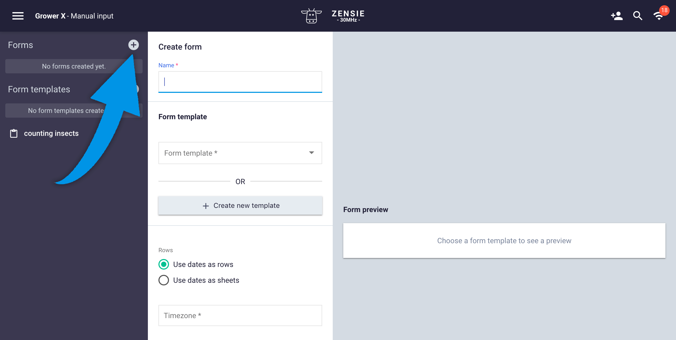
Creating a form template
Go to the main dropdown menu and select “manual input”.

Once you’ve selected manual input, you have two options: forms, and form templates.

First, create a template. That way you can use a form multiple times.
Click the + next to Form templates. As you fill in the information to create your form, you’ll see a preview on the right side of your screen.
 Name your template and add a description.
You can then create columns by clicking on ‘add column’. In this example, we’ll create columns for spider mites, thrips, aphids, etc.
 Choose an icon from the list that best fits the type of information you collect. In this case, we’ll go for the insect icon. Also, select a widget color (this is the single value widget color when added to your dashboard) and set the number of value decimals.
![]()
When you’ve finished customising, click “Create.” The template will be saved.
Templates can always be changed and customised after they’ve been created, but changes will be reflected in all forms created with an adjusted template. If you’d like to create a new form, while keeping an older template intact, we recommend creating a new template.
Creating a new form
To create a new form, click on the (+) next to forms.
 Name the form and select an existing template. For example, the one you just created. If you haven’t created a template yet, click on ‘Create new template’ and go to the previous step in this documentation.
You can now select whether you want to use dates as rows or as sheets. We’ll explain this concept with an example in which we select the option ‘dates as rows’. In this case, weeks are visualized as follows:
 This option is useful when you monitor the number of different kinds of insects, or the same species in different locations within the greenhouse or polytunnel. This way, each row in the sheet represents a different date and each column represents a different insect (as in the example) or a different location. When you use the same template it’s easy to compare the data.
Use the ‘date as sheet’ option when you want to sort the results by days or weeks. That way you can display different locations or projects as rows. It looks like this:
 This is just an example and is not related to the set-up we’ve discussed so far.
Be sure to indicate the correct time zone. This is essential, as the observations you input will receive a time-stamp based upon the time-location, which will be needed to generate graphs.
Using manual input
You can now use a form to enter the values.
Click on ‘add sheet’ and name it.
 Now click on ‘add row’.
 Name the row and select the date on which you’ve entered or will enter the data. It is crucial that the date that you use matches the name you give the row (week numbers or days). Otherwise, you won’t be able to find the correct data. Fill out the values per field by clicking on it and entering the correct number.
You can always adjust the number. Just click or tap the field and change it. Once you’ve entered a row, you can simply add a new row by clicking on ‘add row’ again and follow the same steps as above.
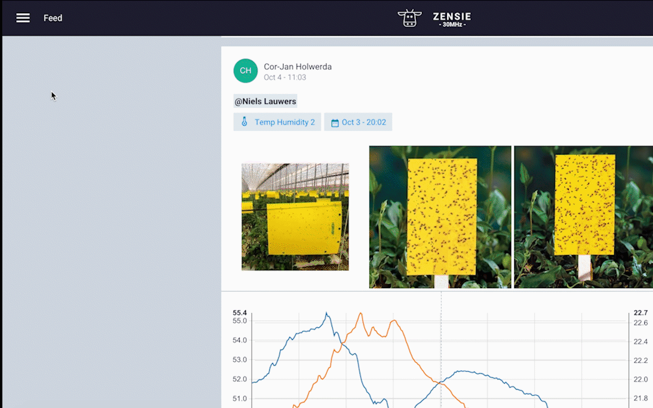
 Post comments
You can also add comments and photos to the data input. As soon as you move your mouse over a field, this icon appears:
![]()
Click the icon and type a comment, @mention people within your organization and/or add images for more context.

Visualise your data with widgets
Manual input is, just like a sensor, a data source. This means that you can use different widgets to interpret the data in an easy way. Navigate to your dashboard (or create a new one) and click on ‘add widget’ to create a new graph, for example.

When creating a graph, you can select what data you want to use. In this case you can find and select your manual input data by entering the name of your form. In our example, this is greenhouse manual input.

Select which values you want to see in the graph. In this example, we select both spider mites and thrips. The widget displays the average values of multiple sheets by default, in this case ‘location 1’ and ‘location 2’. You can display these locations as separate lines in the graph by clicking on the gray box with ‘All avg’ and select the locations you would like to see.


Next step is choosing the correct date interval. Click on the “period” dropdown menu and select “custom start and end date” (scroll down).

Make sure you enter the correct start date and end date (preferably as close as possible to your last data entry). Select the “interval size” (again drop-down menu) that resembles the periods you have entered the data (per week/day/hour).

Click on ‘create’ and you are done.
The explore page
Here you can read the information from all of your sensors with various options to narrow down the exact information you are looking for and export them.


Start off by selecting the sensor you want to get data from.

You can also view multiple sensors at once by selecting more sensors.

On the right upper side of your screen you can see various options.
![]()
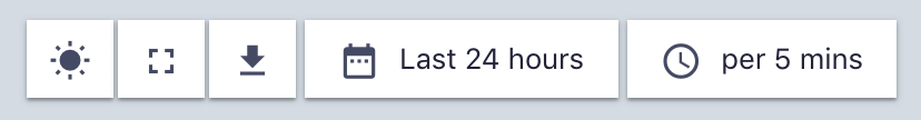
Click on the sun button to show or hide the sunrise/sunset.
Click on the square button to view in full screen.
Click on the arrow button to export the data you are viewing.
Click on the agenda button to select the period of time you would like to view/export.
Click on the clock button to select the period of time you would like to view/export.
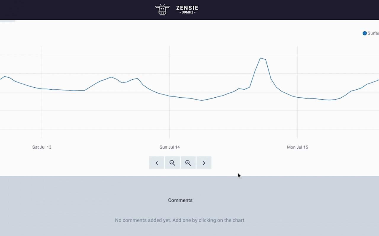
You can also leave comments and add images to those comments.
Sensor notifications
You can receive notifications on your email or by text. For example you can set an alarm for temperature drops or if the temperature gets higher than a certain level.

The dashboard
The second item in the ZENSIE menu is the dashboard. When you click on it you’ll get to the page where you can set up all kinds of analytical widgets.

View all your dashboard in the dashboard page, ready to make a new dashboard? Read all about it here.