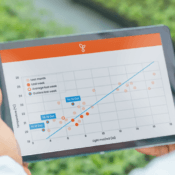
We start off 2020 with these platform improvements
The first round of updates in 2020 is a fact. Based on your feedback (thank you for that!), we’ve improved a couple of things that make the platform is more user-friendly. Amongst these improvements are functionalities that you probably don’t notice at first. But there are also some more notable adjustments. We briefly discuss with you what has changed and improved.
Some classic improvements
We are quite spoiled in today’s world when it comes to using digital applications. Nevertheless, we would like to reflect on these basic improvements. First of all, the axes of graphs now have labels and the graphs themselves load way faster when you use them. You can also save an image of the graph by right-clicking on the graph and choosing save image as. Graphs now also have a so-called crosshair (see No. 1 in the image below). These are the moving vertical and horizontal lines, which makes it easier to read the values on the axes.

Usability smartphone
Of course, mobile-first already was a thing in 2019, but we will happily continue this in the new year. Among other things, we have tackled the touchscreen interaction and it is now working properly. You can now read values, zoom in and scroll with your fingers, etc. Basically doing everything that you’re already used to with other applications. And, as you were able to read earlier this month, you can now also download our platform as a native app on your phone.
Posting comments
Posting comments is slightly different in the new version. Responses can now be placed on a graph line. Move the mouse over a line and click on a data point (see No. 2 in the image above) to post a comment. You will now see a speech bubble appear on the line itself (see No. 3 in the image above). Please note that comments added before this update remain in the old format. Below we show you how this new setup works.
Zoom in on graphs
Finally, we would like to explain to you how we improved the zoom functionality. This first looked like this:

And now like this:

What is striking is that the zoom buttons below the page are gone. Below the graph you’ll find a zoom bar, with which you can define which part of the graph you want to see. You can also no longer click on a graph and drag to zoom in. This functionality was extremely confusing, because it changed the interval. If you want a different interval now, you must use the dropdown. You can now also zoom in (as with many applications) with the keyboard combination ctrl + or by using your mouse wheel, touchpad or touchscreen.


30MHz is typing… Our extended support team is ready to chat!
At 30MHz we think it’s important that our users can use our platform in an optimal way. At times you may have questions and you would like some help from our support team. Email and our support page filled with helpful articles were your go to’s. But we thought it was time for something extra… ...Read more
New 30MHz connect casing: How we protect your tech
To make sure your dataflow is fully protected, 30MHz introduces a new connect casing: waterproof, dust proof and even resistant to hits. This special shield will last longer and ensure a reliable dataflow from the connected sensor. What does that full protection mean? That’s what we will explain in this article. Watertight: resistant to wetness ...Read more
Save energy with RTR
Greenhouse energy waste is invisible. Until the bill arrives. By then, you’re looking at heating costs higher than expected. Energy spend that doesn’t match what you’re getting in return. But energy waste doesn’t happen evenly. It happens in specific moments when temperature and light aren’t balanced. You might be heating when light levels don’t justify ...Read more


